This workflow is perfect for watercolors simulation in Manga Studio or CPS, but fits good for any other technique.
The importance of a seamless texture
A texture brush has the limitation of the pattern repetition: depending on resolution in some cases texture pattern can lift up and be recognizable, giving the typical “digital” look to our works… The only way to avoid this issue is to have a real sized texture as base of our work.
A 600 DPI resolution is a good compromise, it delivers an almost 7000x4900px image.
We need a grayscale picture because color data is useless and increases file size.
This workflow starting point is the acquisition of a real texture, in this case a plain sheet of paper.
The scanner settings have to be a bit under-exposed to have an almost “medium gray”.
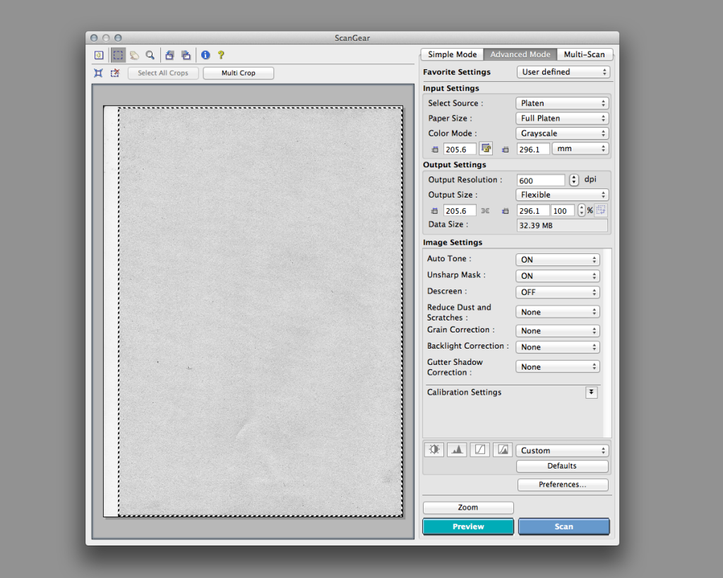
Scanner settings
Tuning and fixing texture in MS
In Manga Studio we have to create two textures from the same scan. The first one is needed to simulate the real grain of paper, the second is the brush texture.
For the first one we need to fix the exposure to reach a more dense result, using tone curve as shown below.
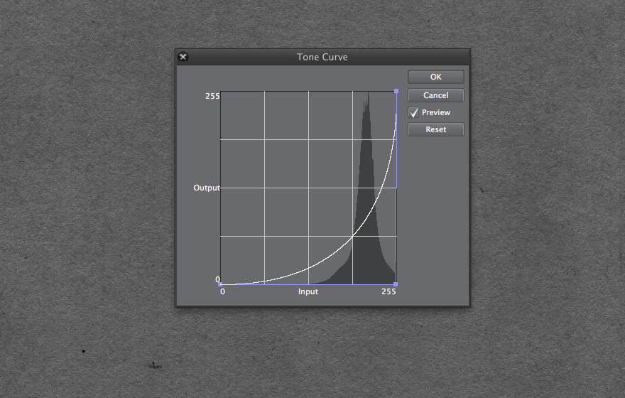
Tone curve for paper
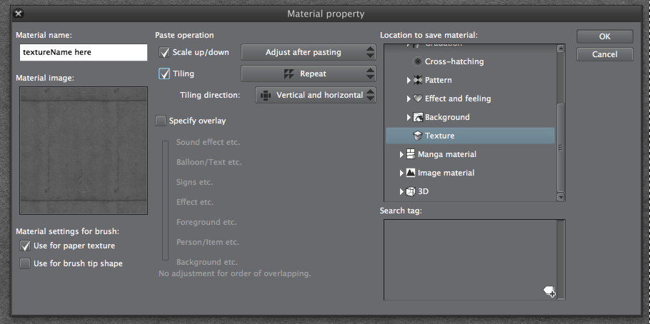
Then we have to select all (CMD+A) and Register as Material form the Edit menu, with the settings shown in the screenshot. Remember to check “use as Paper Texture“!
Now we need to create a texture to simulate the ink/water deposition: as we know paper fibers do not absorb pigment in the same amount. Where the are deeper depressions pigment fill the space available, but in presence of a peak the deposition is less dense.
This is one of the causes of the grainy look in real strokes.
This effect can be achieved using the subtract method to apply texture in Sub Tool Detail/Texture.
But to do this with realism we need the same texture at the same resolution, tuned for this aim.
So we are going to increase the contrast to sharpen peaks and valleys in paper fibers using Levels as shown.
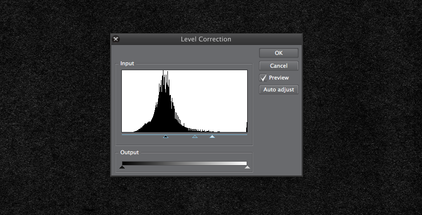
Leves adjustment
This time before registering as material we need to change Layer property selecting only black color (click on the swatch) and then Apply expression color of preview. At this point let’s repeat the steps to save the Texture as material, with another name (eg. Texture for Brush).
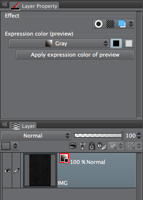
Color Expression has to be baked…
Setting up the canvas
Now we are ready to setup our canvas: first of all drag from materials palette the first Paper Texture and resize it to fit the width, and take note of the scaling ratio that can be found in Tool Property palette.
Change blending of this new layer to Overlay and opacity to any value you prefer (50% does a good job).
Below this layer place your drawing one.
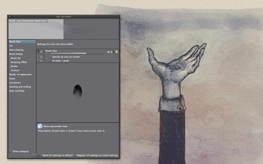
For this tutorial I’m using my Low Absorption Watercolor brush, form my DAUB Brush Set, in which I’ve only changed the default texture to the Texture for Brush produced before, using the same scaling ratio of the paper layer.
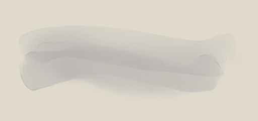
A pure digital watercolor… Good but still fake…
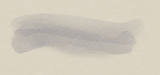
With paper overlay, a nice result… But still lacking a strong look&feel.
In the crop below find the final result: we can notice tiny points on the paper where water is not absorbed, and a subtle paper texture in blocked areas as happens with real watercolors.
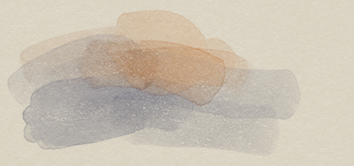
My version, with paper overlay and absorption simulation.
Some final hints!
In this video I’ll show different behaviors, selecting texture parameters
To simulate water and spread colors with this brush, as in the last strokes of the video hit C on the keyboard to switch to transparency painting: it will act as water on paper!
Update
After lots of request I’ve added the texture used in this tutorial, Download hi-res TIFF here!
This is the brush I used in this tutorial.
Can find more on my brush set here, and if you want, purchase it using this link!