In a totally digital creation process, we are somehow driven to use values or hues with a linear approach which is intrinsic to any digital color model. But we know… Human color perception is not linear… To get a more vivid and sharp look&feel, Correction Layers are good choice.
Thanks to non destructive approach of Manga Studio and Clip Studio Paint you can use color correction tools (such as Levels, Curves Hue/Saturation etc…) during the drawing process too.
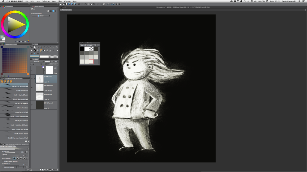
In particular when using dry media tools, as chalks or pastels, sharp textures and grain give more character the final result: for this purpose Tone Curve Layer can be very powerful.
Let’s find few interesting approaches.
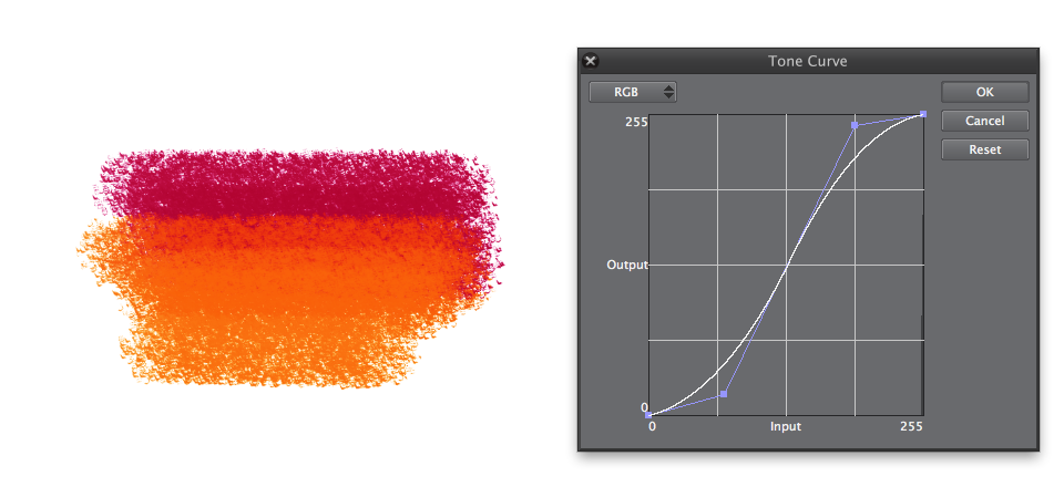
The linear curve

This is the “untouched” image, tones are correct, result is very good, but I’m still not satisfied with the rendering.
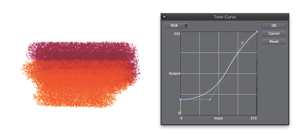
The S shaped curve
This curve is used by almost any digital camera on the planet: the effect is a smooth “compression” of mid-tones (or mid-values if you are painting), with stronger shadows and brightest highlights. The look is in pure Fauve style: aggressive and vivid.
Perfect to emphasize texture and dry strokes.
Lift the foot…
This curve is similar to the one that show old analog negative films as Fuji Superia or Kodak Gold.
Results are somehow “vintage” and darker tones look faded.
The bottom line…
Unfortunately this approach doesn’t allow to use the Alt+click shortcut for color picking, because real colors used are more subtle than the resulting ones that you are going to pick….
Color swatches palette is the only solution: choose your set and you’re done!